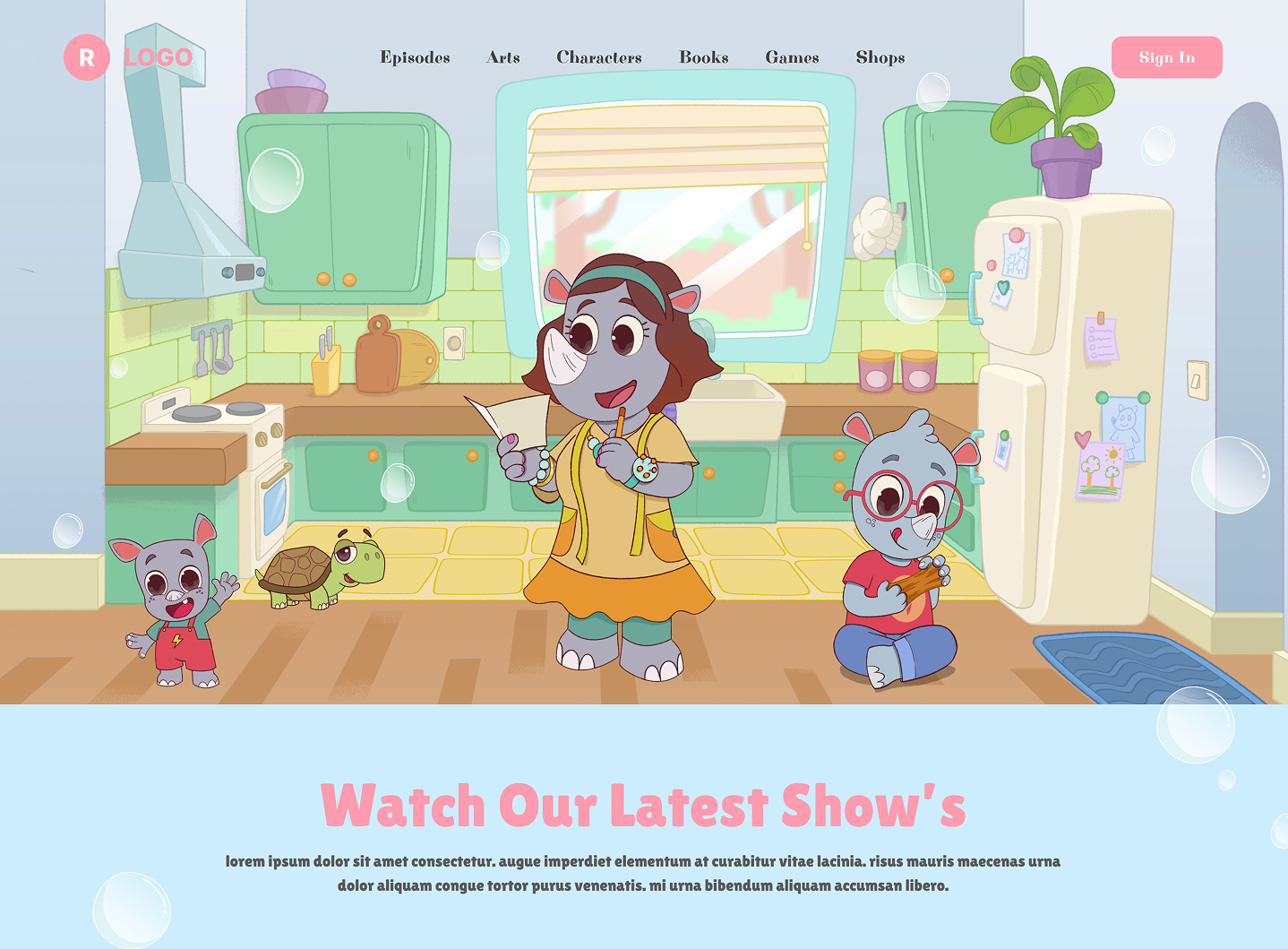
Homepage heroIllustrated characters carry the brand - the audience meets the cast before they read a single word.
A vibrant online home for a children's animated show - designed so kids can dive into episodes and parents can navigate it just as easily.
Homepage heroIllustrated characters carry the brand - the audience meets the cast before they read a single word.
A children's entertainment brand needed a website to host and showcase their animated show. The goal: create a fun, engaging platform where kids and parents could discover episodes, watch content, and connect with the brand.
The client had an animated show ready, but no online home for it. Without a website, there was no way for their audience to find, watch, or follow the show. They needed a platform that felt exciting and on-brand for a young audience - while still being easy for parents to navigate.
The design had to feel like an extension of the show itself, not a separate marketing wrapper around it.
01 - Discovery
Bright colors, playful typography, illustrated characters and simple navigation. The page had to feel like a place a kid would want to be - and that a parent wouldn't dread.
02 - Design
A soft blue + pink palette to feel welcoming. The hero leads with full-bleed character illustrations to create an emotional connection on first scroll.
03 - Structure
The page guides visitors through a clear journey: meet the show, watch the latest episode, browse recent episodes, get in touch. Same loop every time.
Every design decision - color, layout, type - had to communicate fun and energy before a single word was read.
Below the homepage hero, a featured episode block puts the latest release front and centre - title, season, rating, short synopsis, and two large CTAs: Watch Trailer and Watch Now. Pink border, soft drop shadow, illustrated background - it reads at a glance for a child and answers the parent's "what is this?" question at the same time.
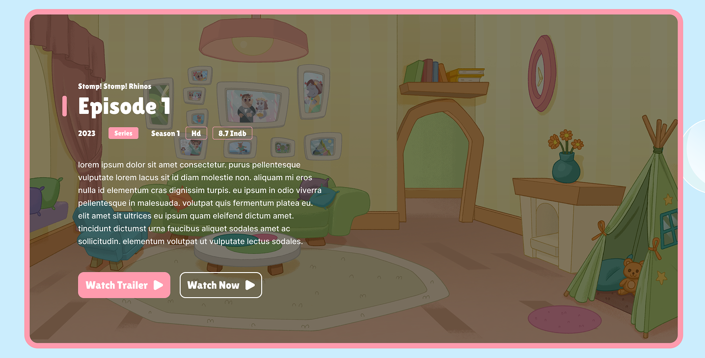
Featured episode cardOne headline, one synopsis, two clear CTAs - no decision paralysis.
The "Recently Watched Episodes" block uses thumbnail-led cards with a "Resume" CTA so returning viewers can pick up exactly where they left off. The illustration style stays consistent with the hero - same characters, same world.
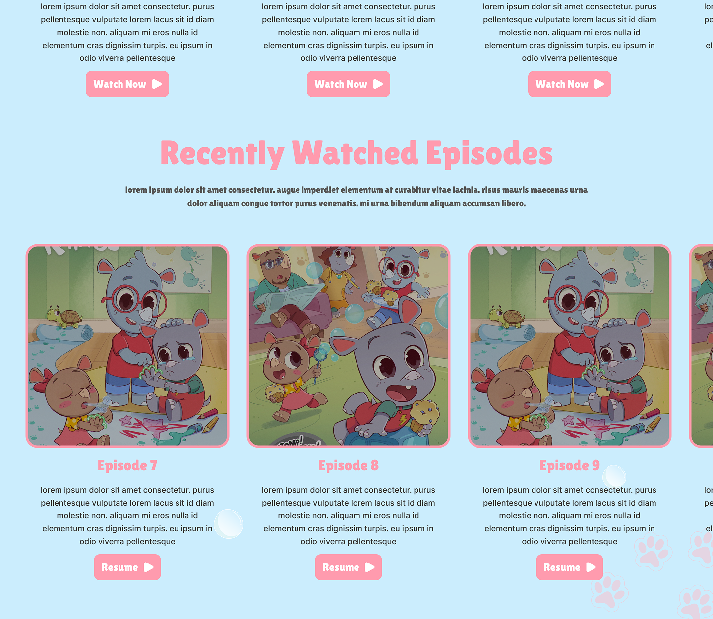
Episodes gridSame card shape, same pink CTA - repetition is what makes the page feel safe to a kid clicking around.
A fully designed kids' entertainment website that gives the show a real online home, making it easy for families to discover and watch content.
Designing for kids taught me how much weight visual storytelling carries. Every design decision - from color to layout - had to communicate fun and energy before a single word was read. For adults you can lean on copy; for kids, the picture is the message.
If you're hiring and want to dig into any of this - what worked, what I'd change next time - drop me a note. I'm always up for a critique.